What is Wayfinding?
Wayfinding is knowing where you are physically, and how to get where you want to be in a space. Clear wayfinding design is intuitive and nonverbal. It helps users to access the various spaces within a building, reducing stress and increasing efficiency.
Wayfinding Design and Architecture
Wayfinding can add to interior architecture’s richness and variety. Articulation of built elements through variation of color, texture, and lighting helps users to orient themselves.
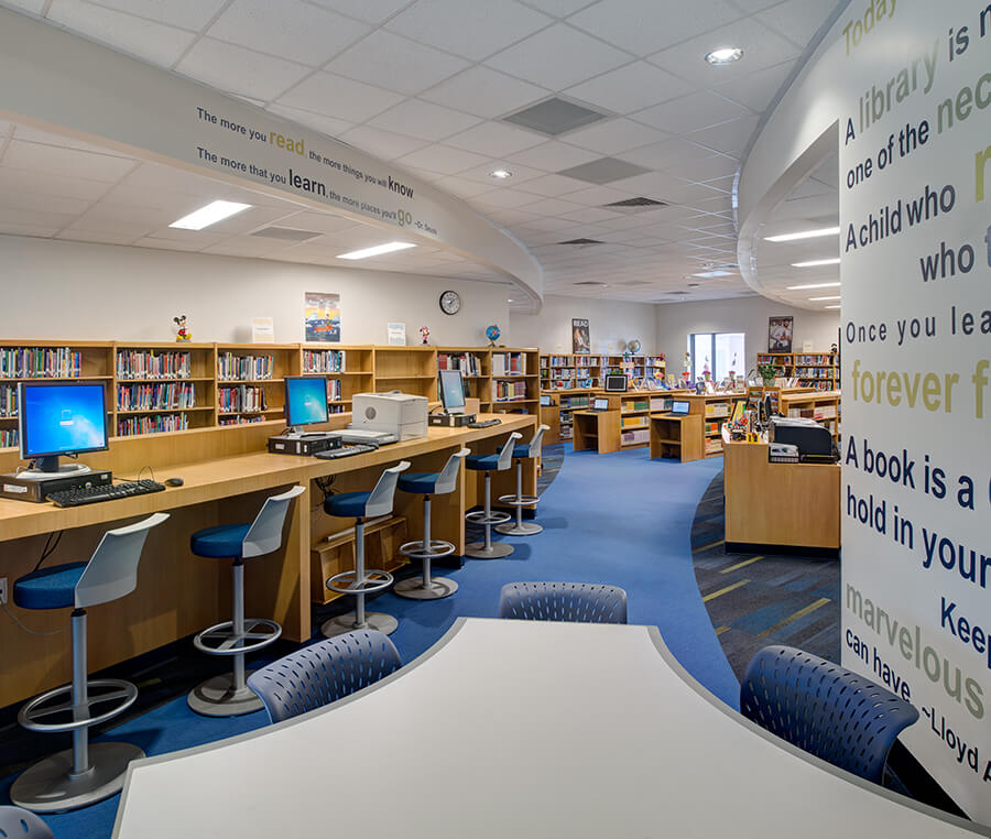
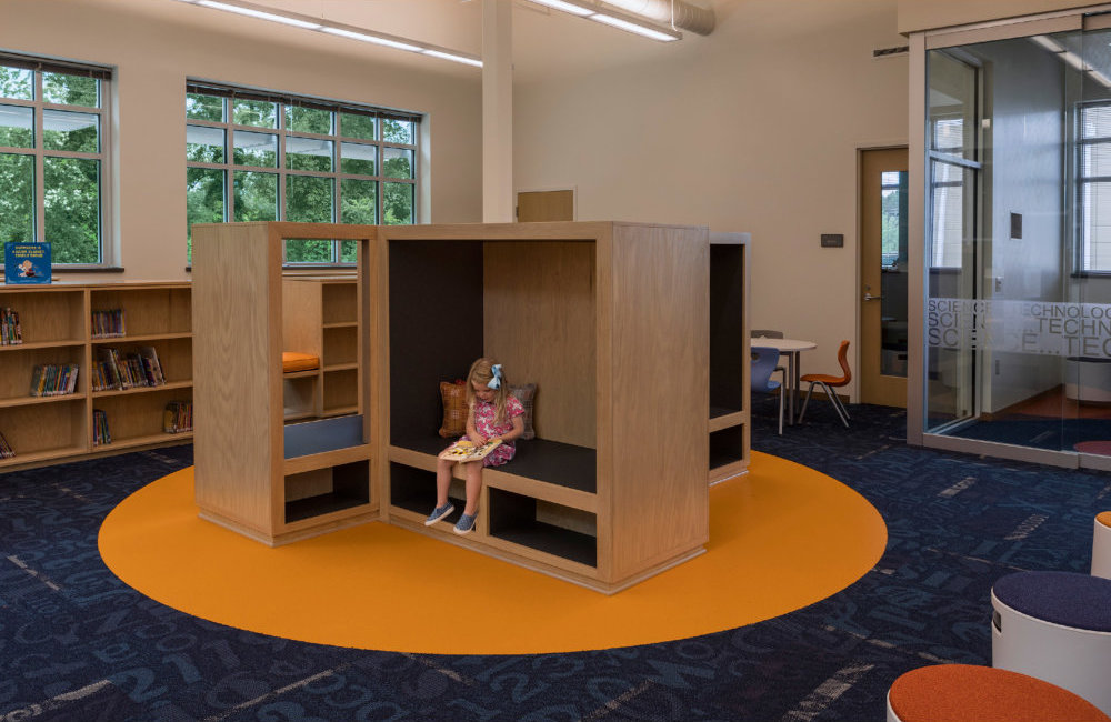
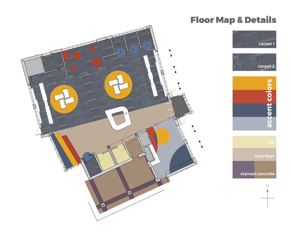
Take, for example, the Legacy Elementary School Library. Variations in floor colors and patterns indicate different purposes, blue dots for tutor rooms, red for lab spaces, and yellow for reading.
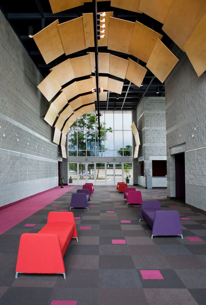
Architecturally, the lobby ceiling feature and glass on each end of the lobby in the Florence Little Theatre pulls guests in and through with deep magenta floor covering that leads to the theater’s entry.
An Architect’s Role
Architects should provide a robust building design that includes wayfinding “baked in” as part of the architectural experience, which then other disciplines can enhance. Even without graphic or interior designers, the architectural design of a building should communicate to end-users how to move through it, where to go and not go, where to collect, or where to rest.
Principles of Wayfinding Design
Visual Identity
Wayfinding does not have to be sign upon sign upon sign. Changes in color, large scale graphics, or interior landmarks orient users without the visual clutter. Use light and color before words. Then use words.
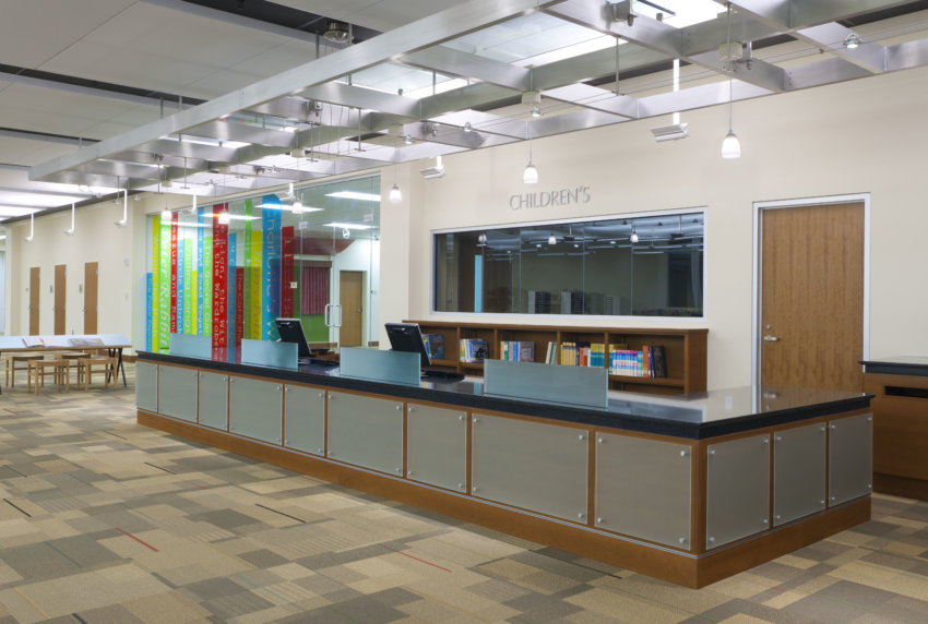
At Augusta Main Library, bright vinyl on the glass made to look like books makes for easy demarcation of the children’s area.
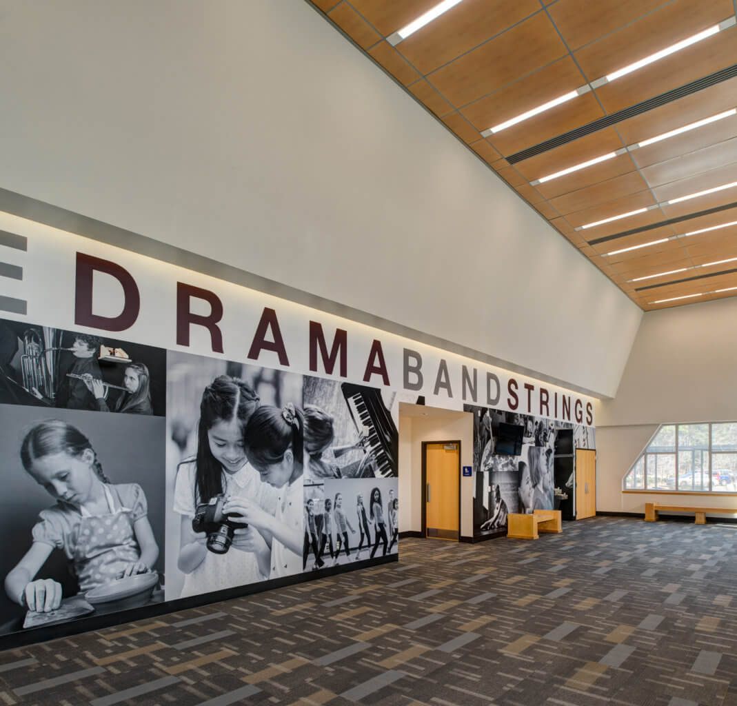
Large graphics outside of the auditorium at Marrington Middle showcase their programs and can be seen from the outside –indicating as you approach, in addition to signage, the use of the building.
Nodes/Landmarks
Wayfinding strategies vary by space and building type. Some spaces, especially information spaces, such as libraries or museums, are designed to be browsed or visited on multiple occasions. In Library or museum design, the stack areas and galleries can be visited individually in any order. The users reorient themselves to a circulation spine, lobby, or view.
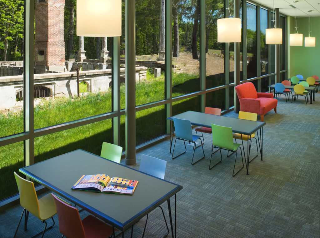
Views to the exterior in any building allow people to “anchor” where that view is from the building’s interior (think: biophilic design). At Pendleton Branch Library, the adult reading area has intentional views to the old ruin.
Well-Ordered Plans
Too many choices in navigation, even when well designed, can be overwhelming for people, especially on their first visit. This means having a well-ordered plan is necessary to good wayfinding design. Limit the choices at intersections and the number of intersections. And if there’s a direction you don’t want people to go at a given intersection, use the color, lighting, and volume of the space to say “wrong way.”
At Cross High School, the Media Center floor and ceiling shape the path of travel.
Long Sight Lines
If possible, try to show people what’s next, by extending a sight line into the next area. Being able to see what is ahead will promote curiosity and exploration, and can reinforce the end-user’s mental map of the space. Most of the time those same sight lines can be used in reverse to help someone backtrack if need be.
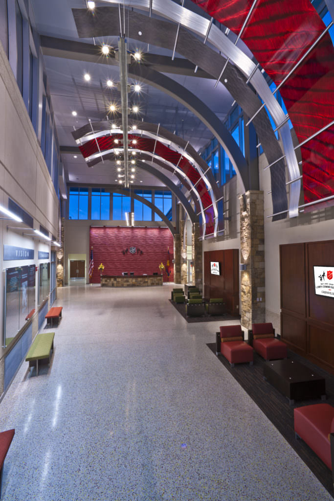
The Salvation Army Kroc Center provides an open entry with lots of glass walls into the gym, pool, classrooms, etc.
Strategic/Storytelling Signage
Provide signage at key decision points for effective wayfinding design. Especially at intersections where taking a wrong turn would waste time or if other visual/tactile cues aren’t enough to help the end-user make an informed decision. Using signage to lead people back to Nodes or Landmarks will further reinforce those locations in the end-user’s mental map.
Storytelling Signage orients a person to where they are, what it is about, how to engage or participate further, and who to recognize for creating that particular place.
Maps
Finally, provide a simplified map or directory. The map can highlight the same Nodes/Landmarks, use the same colors, and maybe even the same graphics as the actual architectural and interior design. Malls and museums have used this technique to great success over the years. The mall directory allows people unfamiliar with the layout to orient themselves. For people that know where things are, the directory can help them set goals for their trip (“I want to shop here, then here, and end here”).
GPS has ruined us. In an age where nearly everyone has a phone that places them at the center of a map, and oriented to the direction the individual is traveling, is it any wonder people have a hard time finding themselves on a floorplan? Wayfinding design is crucial in any architecture plan.
As architects we should understand the end-user’s limitations and design to ease their navigation.


